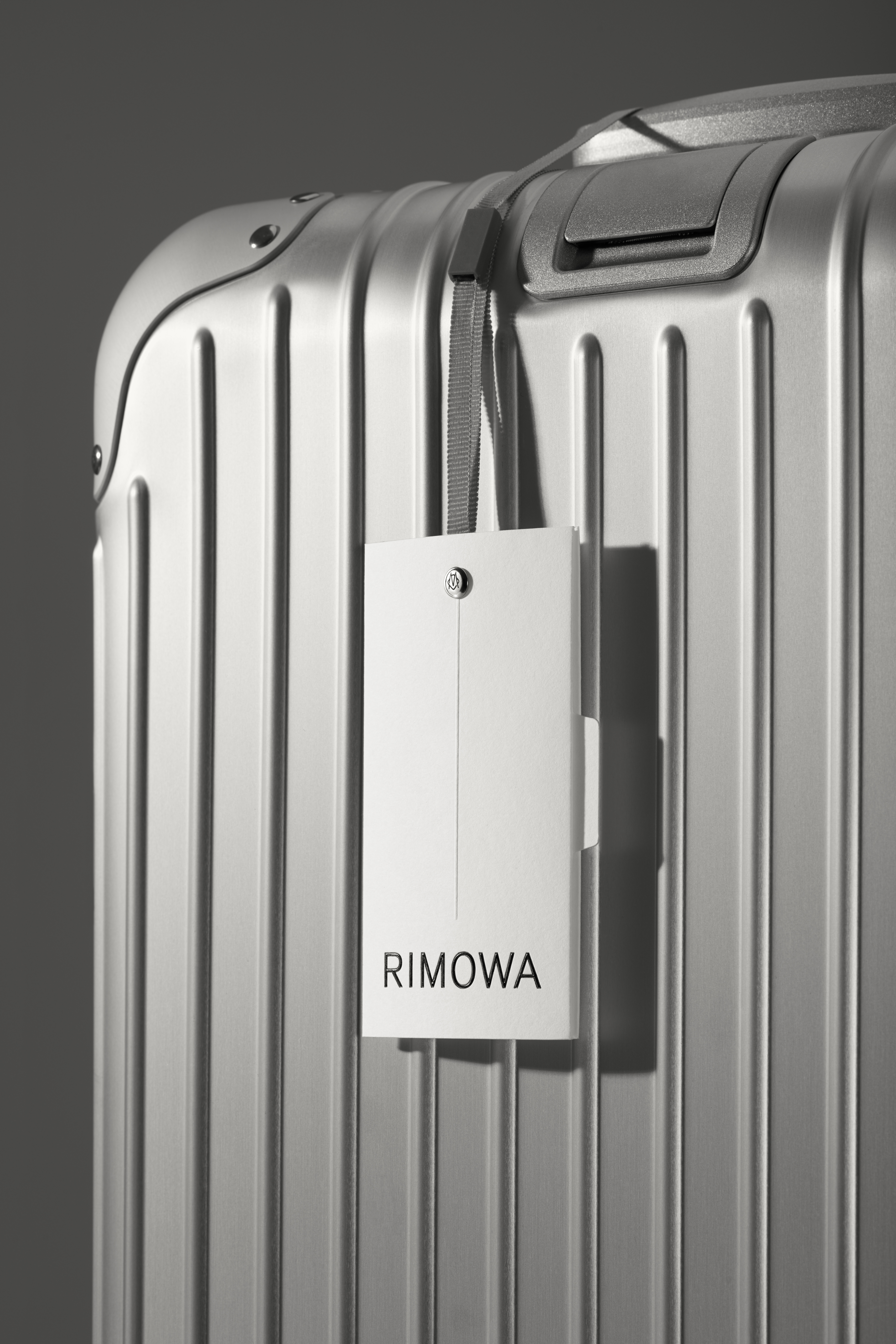
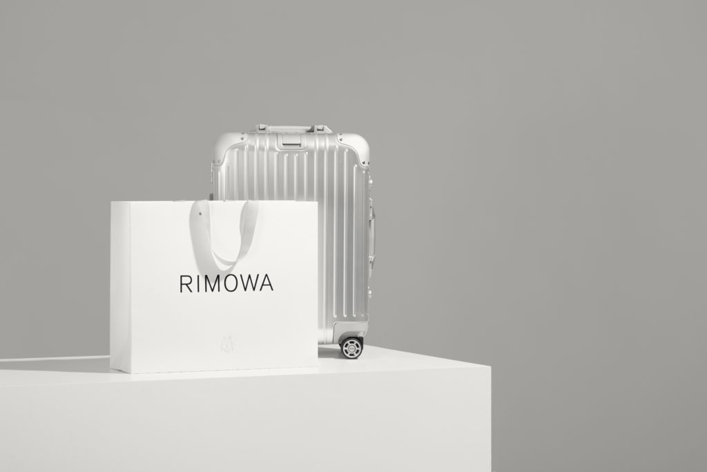
RIMOWA is pleased to announce the launch of the brand’s new visual identity to celebrate its 120th anniversary this year. The new visual identity, supervised by the co-CEO Alexandre Arnault and Chief Brand Officer Hector Muelas, is the result of the collaboration between the concept study, branding and graphic design Bureau Borsche of Monaco and the London design consultant and branding Commission Studio. The new image pays tribute to the cultural heritage of the brand and provides a contemporary and timeless basis for its future development.
Since 1898, the past and present meet in every RIMOWA product. In particular in suitcases, designed and built with a unique process where heritage and craftsmanship coexist with innovation.
The new identity, which includes a renewed logo, monogram, visual language and packaging, aims to create a brand experience that is up to RIMOWA products.
For the RIMOWA logo, Bureau Borsche selected the sans serif font to give a precise direction to the brand’s new typographic language. The refined and discreet forms of the character reflect the functional luxury typical of RIMOWA luggage. Its versatility represents the company’s future ambitions.
As part of the identity system, the RIMOWA logo and monogram will be accompanied by a selection of other visual instruments that pay homage to the brand’s history, with an eye to the future.
A timeless color palette rich in black, white and gray alludes to the historic “less is more” concept, well represented by the historic aluminum suitcase produced by RIMOWA for the first time in 1937.The emblematic parallel striped motif, first introduced in 1950 and featuring the RIMOWA suitcases, will be shown on the owner’s manual and on the nameplate supplied with the suitcase.
The new visual identity, launched globally on 18 January, will be recognizable in the packaging and in the RIMOWA boutiques and incorporated into the product during the year.


No Comment