


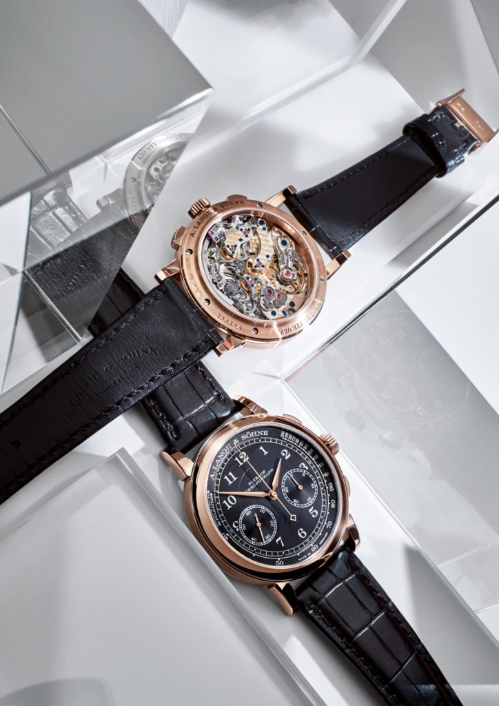
At the Geneva Motor Show at the beginning of the year, A. Lange & Söhne presented five watches with an elegant black dial: two models from SAXONIA MOON PHASE, from SAXONIA OUTSIZE DATE and one from 1815 CHRONOGRAPH. Now available on the Italian market. The Berlinese photographer Attila Hartwig focused on the design of watches with a series of images inspired by architecture.


The clock as an architectural structure
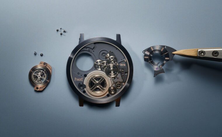
The dial structure of a Lange watch hides an extremely complex mechanism that can be easily compared to Cloud City in Star Wars. The director of product development of A. Lange & Söhne, Anthony de Haas, outlined a science fiction scenario: “If we could teleport ourselves in a multi-level movement, we would explore a mechanical universe where everything is designed with architectural precision and placed exactly in place correct. “Starting from a certain scale, apparent chaos becomes organized, structures are distinguishable and order is established.
“The polished dial of an A. Lange & Söhne watch recalls the elegant façade of a modern building,” reflects Attila Hartwig. The Berlin photographer recently interpreted the new watches: SAXONIA MOON PHASE, SAXONIA OUTSIZE DATE and 1815 CHRONOGRAPH. Inspired by their design, he has built backgrounds composed of panels in Perspex, prisms and mirrors. The transparent materials and the reflecting surfaces create a rigorous architectonic atmosphere.
Design and engineering is the fundamental principles of Lange
The result of the development process that combines technology with timeless craftsmanship and aesthetics is reflected in the new watches: “We made only minor adjustments in the proportions,” explains Anthony de Haas, “but obviously these details have a big impact on the aesthetic appearance. general of a clock. ” Therefore, only one expert would notice that the date of the SAXONIA OUTSIZE DATE is slightly smaller than that of the SAXONIA MOON PHASE. Since the diameter has been reduced from 40 to 38.5 mm, de Hass has decided to proportionally reduce the size of the date – exactly four percent – in order to preserve the visual balance.
The 1815 CHRONOGRAPH quadrant was also carefully studied and enhanced to improve overall harmony: to integrate the peripheral pulsometer scale, the radius of the minute scale had to be reduced. As a result, the hands have been restricted and slightly shortened. The designers replaced the arched mark over the hands with the signature of A. Lange & Söhne on the outer edge of the dial.
Black – The common element
The most important hallmark shared by all five models is the black color of the solid silver dials. Dark backgrounds form a striking contrast to the solid gold hour markers and white lettering. “The polarities and contrasts produce the most vibrant compositions,” says Hartwig. His arrangements emphasize the clarity of the dials in stark contrast to the mechanical complexity of the movements.
A. Lange & Söhne watches are functional and efficient, but the design process does not adhere to the doctrine of “form follows function.” Anthony de Haas’s team has chosen an emotional path: “Of course, the same functionality and precision could be obtained with less effort. But for we, the priority is always the emotional experience. “
Al Salone di Ginevra di inizio d’anno, A. Lange & Söhne ha presentato cinque orologi con un elegante quadrante nero: due modelli del SAXONIA MOON PHASE, del SAXONIA OUTSIZE DATE e uno del 1815 CHRONOGRAPH. Ora disponibili sul mercato Italiano. Il fotografo Berlinese Attila Hartwig si è concentrato sul design degli orologi con una serie di immagini d’ispirazione architettonica.
L’orologio come una struttura architettonica
La struttura del quadrante di un orologio Lange nasconde un meccanismo estremamente complesso che può essere facilmente confrontato con Cloud City in Star Wars. Il direttore dello sviluppo prodotto di A. Lange & Söhne, Anthony de Haas, ha delineato uno scenario fantascientifico: “Se potessimo teletrasportarci in un movimento a più livelli, esploreremmo un universo meccanico in cui tutto è progettato con precisione architettonica e inserito esattamente nel posto corretto. “ Partendo da una certa scala, il caos apparente diventa organizzato, le strutture sono distinguibili e l’ordine è stabilito.
“Il quadrante lucido di un orologio A. Lange & Söhne ricorda l’elegante facciata di un edificio moderno,” riflette Attila Hartwig. Il fotografo di Berlino ha recentemente interpretato i nuovi orologi: SAXONIA MOON PHASE, SAXONIA OUTSIZE DATE e il 1815 CHRONOGRAPH. Ispirato dal loro design, ha costruito sfondi composti da pannelli stratificati in Perspex, prismi e specchi. I materiali trasparenti e le superfici riflettenti creano una rigorosa atmosfera architettoonica.
Design e ingenieria ì principi fondamentali di Lange
Il risultato del processo di sviluppo che abbina tecnologia con artigianalità ed estetica senza tempo, si riflette nei nuovi orologi: “Abbiamo effetuato solo piccoli aggiustamenti nelle proporzioni”, spiega Anthony de Haas, “ma ovviamente tali dettagli hanno un grande impatto sull’aspetto estetico generale di un orologio. “Pertanto, solo un esperto noterebbe che la data del SAXONIA OUTSIZE DATE è leggermente più piccola di quella del SAXONIA MOON PHASE. Dato che il diametro è stato ridotto da 40 a 38,5 millimetri, de Hass ha deciso di ridurre proporzionalmente la dimensione della data – esattamente del quattro percento – al fine di preservare l’equilibrio visivo.
Anche il quadrante del 1815 CHRONOGRAPH è stato accuratamente studiato e valorizzato per migliorare l’armonia generale: per integrare la scala pulsometrica periferica, il raggio della scala dei minuti doveva essere ridotto. Di conseguenza, le lancette sono state ristrette e leggermente accorciate. I designers hanno sostituito il marchio ad arco sopra le lancette con la firma di A. Lange & Söhne sul bordo esterno
del quadrante.
Il Nero – L’elemento comune
Il segno distintivo più importante condiviso da tutti e cinque i modelli è il colore nero dei quadranti in argento massiccio. Gli sfondi scuri formano un sorprendente contrasto con gli indici delle ore in oro massiccio e le scritte bianche. “Le polarità e i contrasti producono le composizioni più vivaci”, afferma Hartwig. I suoi arrangiamenti enfatizzano la chiarezza dei quadranti in netto contrasto con la complessità meccanica dei movimenti.
Gli orologi A. Lange & Söhne sono funzionali ed efficienti, ma il processo di progettazione non aderisce alla dottrina della “forma segue la funzione”. Il team di Anthony de Haas ha scelto una strada emozionale: “Naturalmente, la stessa funzionalità e precisione potrebbero essere ottenute con meno sforzo. Ma per noi, la priorità è sempre l’esperienza emotiva. “
No Comment